

在这次介绍中,我们将展示如何仅使用 HTML 和 CSS 创建对话框设计样本。我们将它们收集在一起,从简单的到圆形、对话形式、微信风格的样本。您可以使用复制粘贴 HTML 和 CSS。
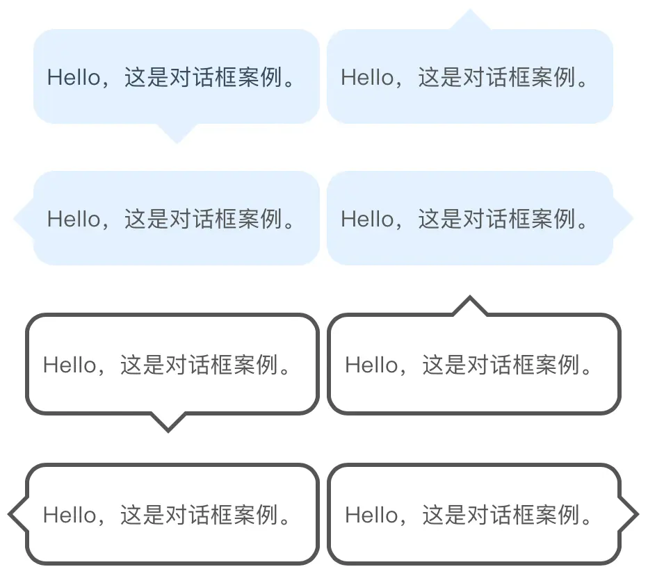
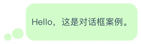
这是最简单的形式。我们将分别介绍将三角形位置配置在上、下、左、右的样本。如果您看看代码,您会发现有两个标记为“#e9edff”的部分,这是指定背景颜色的代码。如果您喜欢,可以更改它。顺便说一句,从下面延伸的三角形是用伪元素(before)表示的。如果感兴趣,请看一看下面的文章。
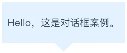
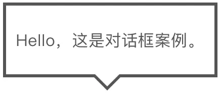
对话框向下
<div class="arrowbox1">
  <p>Hello,这是对话框案例。</p>
</div>.arrowbox1 {
position: relative;
display: inline-block;
margin: 1.5em 0;
padding: 20px 10px;
min-width: 120px;
max-width: 100%;
color: #555;
font-size: 16px;
background: #e0f2ff;
}
.arrowbox1:before {
content: "";
position: absolute;
top: 100%;
left: 50%;
margin-left: -15px;
border: 15px solid transparent;
border-top: 15px solid #e0f2ff;
}
.arrowbox1 p {
margin: 0;
padding: 0;
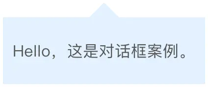
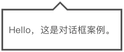
}对话框向上
<div class="arrowbox1-top">
  <p>Hello,这是对话框案例。</p>
</div>.arrowbox1-top {
position: relative;
display: inline-block;
margin: 1.5em 0;
padding: 20px 10px;
min-width: 120px;
max-width: 100%;
color: #555;
font-size: 16px;
background: #e0f2ff;
}
.arrowbox1-top:before {
content: "";
position: absolute;
top: -30px;
left: 50%;
margin-left: -15px;
border: 15px solid transparent;
border-bottom: 15px solid #e0f2ff;
}
.arrowbox1-top p {
margin: 0;
padding: 0;
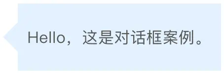
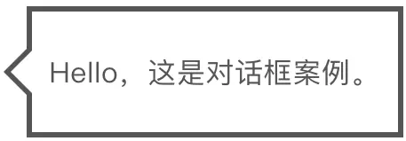
}对话框向左
<div class="arrowbox1-left">
  <p>Hello,这是对话框案例。</p>
</div>.arrowbox1-left {
position: relative;
display: inline-block;
margin: 1.5em 0 1.5em 15px;
padding: 20px 10px;
min-width: 120px;
max-width: 100%;
color: #555;
font-size: 16px;
background: #e0f2ff;
}
.arrowbox1-left:before {
content: "";
position: absolute;
top: 50%;
left: -30px;
margin-top: -15px;
border: 15px solid transparent;
border-right: 15px solid #e0f2ff;
}
.arrowbox1-left p {
margin: 0;
padding: 0;
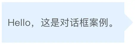
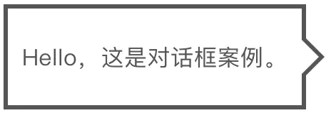
}对话框向右
<div class="arrowbox1-right">
  <p>Hello,这是对话框案例。</p>
</div>.arrowbox1-right {
position: relative;
display: inline-block;
margin: 1.5em 15px 1.5em 0;
padding: 20px 10px;
min-width: 120px;
max-width: 100%;
float: right;
clear: both;
color: #555;
font-size: 16px;
background: #e0f2ff;
}
.arrowbox1-right:before {
content: "";
position: absolute;
top: 50%;
left: 100%;
margin-top: -15px;
border: 15px solid transparent;
border-left: 15px solid #e0f2ff;
}
.arrowbox1-right p {
margin: 0;
padding: 0;
}根据上面的示例,我试着用“边框”而不是填充来展示形状。具体来说,我制作了一个“黑色三角形”和一个“白色三角形”,并将它们叠在一起以创建三角形的线条。它也是响应式的,就像之前一样(它还支持换行)。
对话框向下
<div class="arrowbox2">
  <p>Hello,这是对话框案例。</p>
</div>.arrowbox2 {
position: relative;
display: inline-block;
margin: 1.5em 0;
padding: 20px 10px;
min-width: 120px;
max-width: 100%;
color: #555;
font-size: 16px;
background: #FFF;
border: solid 3px #555;
box-sizing: border-box;
}
.arrowbox2:before {
content: "";
position: absolute;
bottom: -24px;
left: 50%;
margin-left: -15px;
border: 12px solid transparent;
border-top: 12px solid #FFF;
z-index: 2;
}
.arrowbox2:after {
content: "";
position: absolute;
bottom: -30px;
left: 50%;
margin-left: -17px;
border: 14px solid transparent;
border-top: 14px solid #555;
z-index: 1;
}
.arrowbox2 p {
margin: 0;
padding: 0;
}对话框向上
<div class="arrowbox2-top">
  <p>Hello,这是对话框案例。</p>
</div>.arrowbox2-top {
position: relative;
display: inline-block;
margin: 1.5em 0;
padding: 20px 10px;
min-width: 120px;
max-width: 100%;
color: #555;
font-size: 16px;
background: #FFF;
border: solid 3px #555;
box-sizing: border-box;
}
.arrowbox2-top:before {
content: "";
position: absolute;
top: -24px;
left: 50%;
margin-left: -15px;
border: 12px solid transparent;
border-bottom: 12px solid #FFF;
z-index: 2;
}
.arrowbox2-top:after {
content: "";
position: absolute;
top: -30px;
left: 50%;
margin-left: -17px;
border: 14px solid transparent;
border-bottom: 14px solid #555;
z-index: 1;
}
.arrowbox2-top p {
margin: 0;
padding: 0;
}对话框向左
<div class="arrowbox2-left">
  <p>Hello,这是对话框案例。</p>
</div>.arrowbox2-left {
position: relative;
display: inline-block;
margin: 1.5em 0 1.5em 15px;
padding: 20px 10px;
min-width: 120px;
max-width: 100%;
color: #555;
font-size: 16px;
background: #FFF;
border: solid 3px #555;
box-sizing: border-box;
}
.arrowbox2-left:before {
content: "";
position: absolute;
top: 50%;
left: -24px;
margin-top: -12px;
border: 12px solid transparent;
border-right: 12px solid #FFF;
z-index: 2;
}
.arrowbox2-left:after {
content: "";
position: absolute;
top: 50%;
left: -30px;
margin-top: -14px;
border: 14px solid transparent;
border-right: 14px solid #555;
z-index: 1;
}
.arrowbox2-left p {
margin: 0;
padding: 0;
}对话框向右
<div class="arrowbox2-right">
  <p>Hello,这是对话框案例。</p>
</div>.arrowbox2-right {
position: relative;
display: inline-block;
margin: 1.5em 15px 1.5em 0;
padding: 20px 10px;
min-width: 120px;
max-width: 100%;
float: right;
clear: both;
color: #555;
font-size: 16px;
background: #FFF;
border: solid 3px #555;
box-sizing: border-box;
}
.arrowbox2-right:before {
content: "";
position: absolute;
top: 50%;
right: -24px;
margin-top: -12px;
border: 12px solid transparent;
border-left: 12px solid #FFF;
z-index: 2;
}
.arrowbox2-right:after {
content: "";
position: absolute;
top: 50%;
right: -30px;
margin-top: -14px;
border: 14px solid transparent;
border-left: 14px solid #555;
z-index: 1;
}
.arrowbox2-right p {
margin: 0;
padding: 0;
}
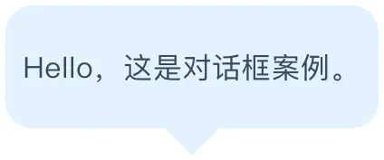
在之前介绍的对话框角上,可以简单地添加圆角。方法是在上面介绍的代码中的.balloon◯◯{~}中添加border-radius:◯◯px;即可。

border-radius 是用于指定边框圆角的 CSS 属性。例如,如果写成 border-radius: 10px;,边框角将会变成10px的圆角。微信对话框也可以这样修改该参数调整出来。
CSS的编写方法
试着将本文开头介绍的对话框直角变成圆角吧。
<div class="arrowbox1">
  <p>Hello,这是对话框案例。</p>
</div>.arrowbox1 {
position: relative;
display: inline-block;
margin: 1.5em 0;
padding: 20px 10px;
min-width: 120px;
max-width: 100%;
color: #555;
font-size: 16px;
background: #e0f2ff;
border-radius: 15px;
}
.arrowbox1:before {
content: "";
position: absolute;
top: 100%;
left: 50%;
margin-left: -15px;
border: 15px solid transparent;
border-top: 15px solid #e0f2ff;
}
.arrowbox1 p {
margin: 0;
padding: 0;
}这段代码的表示如下。在带边框版本中也可以使用”border-radius”来添加圆角。
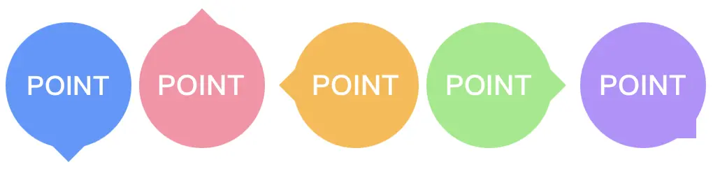
接下来,我们介绍圆形气泡对话框。这里需要注意的,如果文字显示在中央的圆形中,换行会使设计变得混乱。
因此,当使用下面介绍的示例时,请确保只使用数字或一个单词,并缩短文字。
另外,可以通过更改width,height和line-height的 px 值来调整圆的大小(3个都要相同!)。
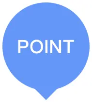
对话框向下
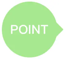
<div class="arrowbox3">
  <p>POINT</p>
</div>.arrowbox3 {
position: relative;
display: inline-block;
padding: 0 5px;
margin: 1.5em 0;
width: 90px;
height: 90px;
line-height: 90px;
text-align: center;
font-size: 20px;
font-weight: bold;
color: #FFF;
background: #5796ff;
border-radius: 50%;
box-sizing: border-box;
}
.arrowbox3:before {
content: "";
position: absolute;
bottom: -25px;
left: 50%;
margin-left: -15px;
border: 15px solid transparent;
border-top: 15px solid #5796ff;
z-index: 0;
}
.arrowbox3 p {
line-height: 90px !important;
}对话框向上
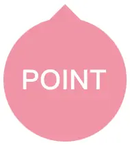
<div class="arrowbox3-top">
  POINT
</div>.arrowbox3-top {
position: relative;
display: inline-block;
padding: 0 5px;
margin: 1.5em 0;
width: 90px;
height: 90px;
line-height: 90px;
text-align: center;
font-size: 20px;
font-weight: bold;
color: #FFF;
background: #ff8ea6;
border-radius: 50%;
box-sizing: border-box;
}
.arrowbox3-top:before {
content: "";
position: absolute;
top: -25px;
left: 50%;
margin-left: -15px;
border: 15px solid transparent;
border-bottom: 15px solid #ff8ea6;
z-index: 0;
}对话框向左
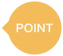
<div class="arrowbox3-left">
  POINT
</div>.arrowbox3-left {
position: relative;
display: inline-block;
padding: 0 5px;
margin: 1.5em 0 1.5em 15px;
width: 90px;
height: 90px;
line-height: 90px;
text-align: center;
font-size: 20px;
font-weight: bold;
color: #FFF;
background: #ffb942;
border-radius: 50%;
box-sizing: border-box;
}
.arrowbox3-left:before {
content: "";
position: absolute;
top: 50%;
left: -25px;
margin-top: -15px;
border: 15px solid transparent;
border-right: 15px solid #ffb942;
z-index: 0;
}对话框向右
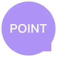
<div class="arrowbox3-right">
  POINT
</div>.arrowbox3-right {
position: relative;
display: inline-block;
padding: 0 5px;
margin: 1.5em 15px 1.5em 0;
width: 90px;
height: 90px;
line-height: 90px;
text-align: center;
font-size: 20px;
font-weight: bold;
color: #FFF;
background: #92eb84;
border-radius: 50%;
box-sizing: border-box;
}
.arrowbox3-right:before {
content: "";
position: absolute;
top: 50%;
right: -25px;
margin-top: -15px;
border: 15px solid transparent;
border-left: 15px solid #92eb84;
z-index: 0;
}对话框向侧边
<div class="arrowbox3-right-btm">
  POINT
</div>.arrowbox3-right-btm {
position: relative;
display: inline-block;
padding: 0 5px;
margin: 1.5em 15px 1.5em 0;
width: 90px;
height: 90px;
line-height: 90px;
text-align: center;
font-size: 20px;
font-weight: bold;
color: #FFF;
background: #b88eff;
border-radius: 50%;
box-sizing: border-box;
}
.arrowbox3-right-btm:before {
content: "";
position: absolute;
bottom: -8px;
right: -8px;
margin-top: -15px;
border: 15px solid transparent;
border-left: 15px solid #b88eff;
z-index: 0;
-webkit-transform: rotate(45deg);
transform: rotate(45deg);
}
我们用两个小圆代替三角形,设计出了一种“思考模式”的样式。请根据需要更改背景颜色(#c7ffc6表示背景颜色的颜色码,请确保三个地方都是同样的码)。
<div class="arrowbox4">
  Hello,这是对话框案例。
</div>.arrowbox4 {
position: relative;
display: inline-block;
margin: 2em 0 2em 40px;
padding: 20px 10px;
background: #c7ffc6;
border-radius: 15px;
}
.arrowbox4:after {
content: "";
position: absolute;
height: 18px;
bottom: 3px;
left: -24px;
width: 20px;
background: #c7ffc6;
border-radius: 50%;
}
.arrowbox4:before {
content: "";
position: absolute;
height: 12px;
bottom: 0;
left: -38px;
width: 13px;
background: #c7ffc6;
border-radius: 50%;
}
.arrowbox4 p {
margin: 0;
padding: 0;
}接下来,我们将介绍如何制作类似人物或角色在说话的“会话风格喷泉”,近来在博客等中经常能看到。
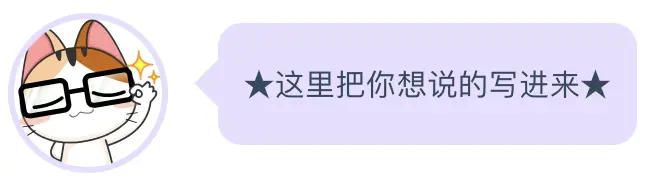
- 将以下CSS预先复制到CSS文件中
- 在HTML的“★在这里放入图片★”部分添加img标签作为图标图像,并将整个HTML保存到记事本等中。
- 在需要使用会话喷泉的部分,粘贴②的HTML。
- 在代码中的“★这里输入文章★”部分编写台词。
<!--聊天对话框开头-->
<div class="arrowbox5">
  <div class="faceicon">
    ★这里放入图片 <img~>★
  </div>
  <div class="chatting">
    <div class="says">
      <p>★这里把你想说的写进来★</p>
    </div>
  </div>
</div>
<!--聊天对话框结尾-->.arrowbox5 {
width: 100%;
margin: 1.5em 0;
overflow: hidden;
}
.arrowbox5 .faceicon {
float: left;
margin-right: -90px;
width: 80px;
}
.arrowbox5 .faceicon img{
width: 100%;
height: auto;
border: solid 3px #e7ddff;
border-radius: 50%;
}
.arrowbox5 .chatting {
width: 100%;
}
.says {
display: inline-block;
position: relative;
margin: 5px 0 0 105px;
padding: 17px 13px;
border-radius: 12px;
background: #e7ddff;
}
.says:after {
content: "";
display: inline-block;
position: absolute;
top: 18px;
left: -24px;
border: 12px solid transparent;
border-right: 12px solid #e7ddff;
}
.says p {
margin: 0;
padding: 0;
}
如果你想细致地指定颜色和线条等样式,但不想修改代码,那么请一定要使用它。
我们已经介绍了使用仅 CSS 制作的吹气球的类型和方法。
请在网页上使用会话形式的文本或要强调的内容进行尝试。
如果您应用了以前的示例,可能会创建出您专属的独特的吹气球。
首先使用上述内容进行复制并使用,然后逐渐更改参数并检查结果,不会有问题。
CSS 代码部分的结构可能有点复杂,但如果使用生成器,就可以立即实现。